Rowanbank Gardens - A Marketing Review

It is always a pleasure to look back on a project when approaching the finish line for it, and with Rowanbank Gardens, this remains to be true. The creative team at Nest Marketing were delighted to be selected as the agency to spearhead the fully-integrated marketing campaign for this development. Working closely with Artisan Real Estate and 7N Architects, the teams were able to construct a development which brings a sense of community, sustainability and environmental commitment to Edinburgh.
It was a joy to trace back the months and watch the brand identity form - and come to life - through the website, suite of brochures and other creative assets produced for this development. Whilst this project is ongoing with an assortment of other exciting customer experience-based assets in the pipeline for production - with the public launch of the website marks the official publication of Rowanbank Gardens.
The Brief
The brief was simple.
To create a fully-integrated, marketing campaign for their latest, sustainable, luxury 126-home development; ensuring that prospective buyers are given compelling insight to make an informed off-plan purchase.
Artisan Real Estate is widely renowned for their attention to detail, and uncompromising dedication to green living. To which end, many fascinating discussions were had regarding the exactitudes of creating a marketing campaign which was reflective of such an environmentally friendly, and attractive new build.
Our Response (in short)
Brand Identity - Logo Suits, Tone of Voice, Fonts & Brand Guidelines
Bespoke Website – Pre Launch Website & Fully Optimised Site
Crafted Brochures
Plot (Apartment) Selector – Encompassing precise details and specifications for each individual plot
CGIs – External & Internal CGI, illustrating the spectacular spaces that the development boasts
Off-Plan Internal & External Development Videos
3D & 2D Floor Plans
Emailer – As part of a pre-launch and launch campaign
Print – Hoarding, Signage & Sales Suite
Copywriting – Across all of the above creative elements

Brand Identity
A welcoming, accessible and friendly brand needed to be built as a starting point; Rowanbank Gardens had to come across as a new-build development with a conscience. With ample green space and sustainability woven deep into the fibres of the architecture, Nest Marketing were tasked with painting a picture of how living green can, and should, be sexy.
Colours were kept to warming greens, grounding neutrals and flickers of deep berry hues - intentionally kept vibrant and vivacious to catch the eye and engage the viewer.
The logo was an amalgamation of several concepts: we loved the visualisation of the Rowan berry - an elegant and friendly symbol of the development. Coupled with a modern sans-serif font, the look and feel of the development from the outset was kept clean and contemporary. The stylised berry was placed as the Rowanbank “O” - and thus a logo, and logo mark, was born.

Website
In so following the brief to make a slick, contemporary and visually stunning website, the team at Nest Marketing ensured every page was image-led and optimized for the best user experience. A peaceful woodscape video provides a meditative background to the home page; each button custom to the brand. Key CTA areas feature bespoke gradients, which add visual depth and subtle shading. Soft textured banners provide ample space for descriptive text, whilst the apartments themselves sit on a CGI-led plot selector - available to view within an eyeframe on the site, or to open up full screen in a separate tab for the full interactive experience.
The site can be accessed here: https://www.rowanbankgardens.com/


The Brochures
Four sparkling jewel tones were selected to categorise the four different core brochures - each one a symbol of the name. Appleberry, Bramble, Cranberry and Damson all sit as vibrant and cohesive designs, making use of tonal layering and pared-back layouts. Coupled with gentle textures and flashes of scarlet Rowan berries, the brochure design offers an organic and comforting visual experience.
The lifestyle brochure - the hero brochure of the campaign - features a variety of showstopping photography with heavy emphasis on image-led pages. A celebration of everything Rowanbank Gardens, the lifestyle brochure tells the story of life at the development. Everything from the carbon-neutral architecture, to the shared community garden, was showcased through our CGI imagery and icons as eye-catching visuals. Custom branded maps highlight key areas of interest, followed by the history of the Rowan tree, which provides interested parties with the unexpectedly mysterious origins of the berries.

Rowanbank Gardens Brochure Design
Plot Selector
A fundamental element to the website, the plot selector - aptly renamed as the apartment selector - is a constantly-updating and sophisticated piece of software which brings the website to a whole new level. Featuring vital information on every single apartment, all floor plans, specifications and CGI imagery, this piece of tech allows the viewer to access a completely remote tour of any apartment.
A traffic light system was also implemented as a fantastic tool for guiding customers through the availability of plots. With green set as ‘available’, white as ‘reserved’ and a sunshine yellow for ‘unreleased’ - this easily-followed code directs interested parties effectively to what they are looking for.
With the addition of an interactive lifestyle brochure and custom map which calculates routes from the development to the amenity of your choice, the plot selector elevates the user experience to something extraordinary.


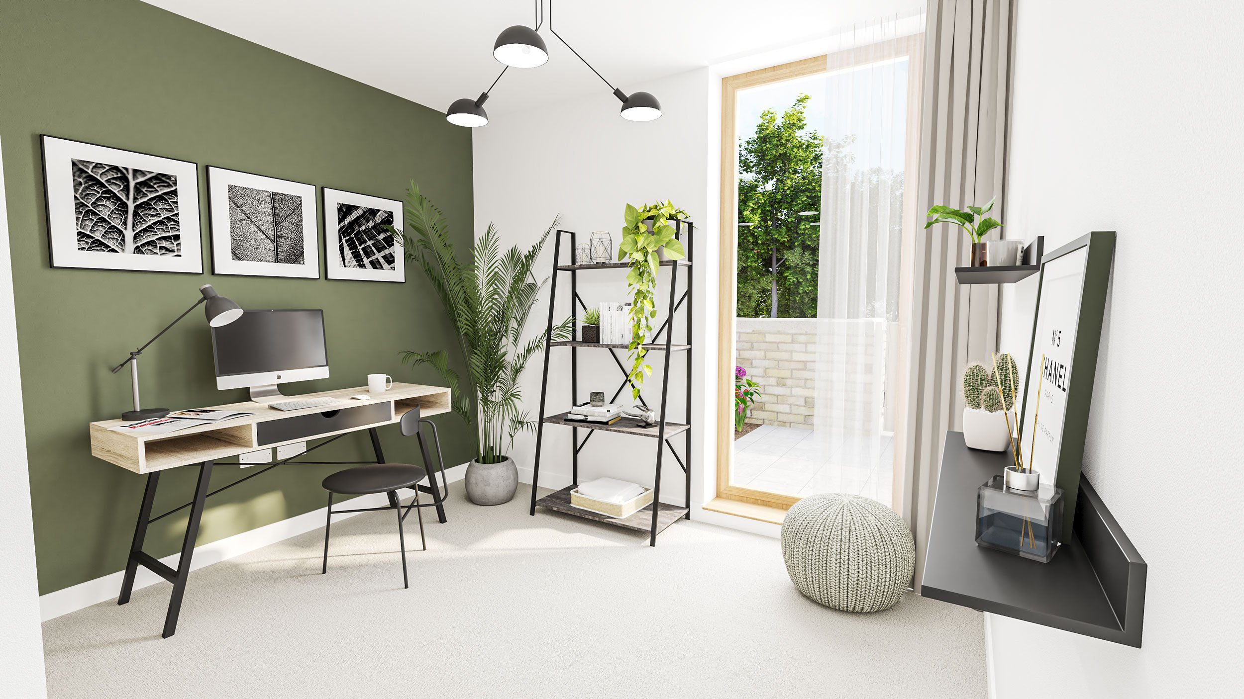
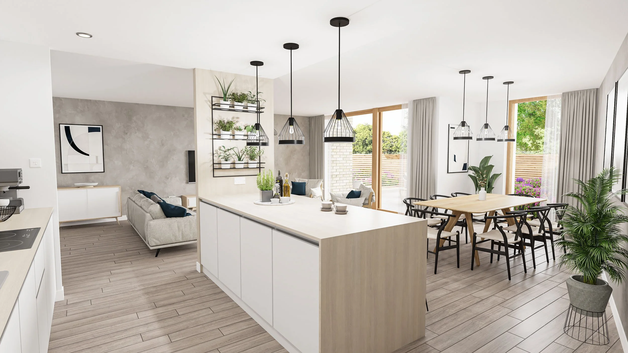
CGIs
The internal and external CGIs are what bring the vibrancy and community spirit of Rowanbank Gardens to life. Featuring a swathe of imagery which showcases the beautiful living spaces and architecture of the development, these CGIs are the stand-out pieces of this marketing campaign.
By observing key demographics such as families, downsizers and first-time buyers, we articulated the interior design to suit these segments. By aiming for natural and accessible furnishings, prospective buyers are able to visualise themselves settling into their new home here.
Heavily featured within the website, plot selector, and all other visual assets, the sunny rooms and dazzling gardens take centre stage. Interiors feature light and contemporary furnishings, cohesively marrying organic textures with sturdy finishings. Soft greens were utilized through office and living spaces, with kitchens featuring splashes of colour: sparkling lemon yellows paired with neutral mahogany wood. Plenty of natural greenery was brought through with a selection of botanicals, with specific angles used to highlight the ample access to the shared gardens within the development. With both bright sunny days and warm dusk shots, the variation to these images are powerful reminders of the importance of visual marketing.


Off-Plan Internal and External Development Videos
Much like the static CGI images, a virtual tour of the development is key in allowing the viewer to visualise the development. Three CGI tours were made in total:
Internal Virtual Tour - a detailed property walkthrough, showcasing interior design and amenities.
External - development-wide external flyover, highlighting the major features of the gardens - the potting sheds, the playground and bike storage areas
Hero - the showstopper: highlighting the expansive garden grounds, the externals of the development, as well as an internal tour of an apartment.
By producing the virtual tours with a variety of content, prospective buyers are given the opportunity to make an informed decision and experience the development in an entirely bespoke way. With elegant custom motion graphics within each animated video pointing to key features of the apartment, along with contemporary backing tracks, the videos provide engaging and informative content for the viewer.
To view all virtual tours, please click here: https://www.rowanbankgardens.com/gallery
3D & 2D Schematic Floor Plans
To assist future buyers in visualising their new home, a comprehensive selection of floor plan options is vital, so naturally both 3D and 2D floor plans were created for Rowanbank Gardens.
Whilst the 2D schematics are ideal for more technical mapping, the 3D floor plans showcase the scale of the rooms, and engage the viewer through a more colourful, dynamic visual, as well as helping you see the room’s potential and possible layouts. With furnishings and architectural aspects inserted to scale, 3D floorplans are fantastic tools in sparking creativity and ideas for future buyers. These were placed on the plot selector for every apartment, as well as sample floor plans featured on the website for a snapshot of life at this development.

Mailer
The mailer was intended to distill the essence of the development, whilst inciting curiosity and intrigue. By closely following the structure and information disclosed in the pre-launch website, readers were able to catch a glimpse of the development’s key CGI images, read about the sustainability initiative of Rowanbank Gardens, and where to find further information should they be interested.
Results
The mailer performed incredibly well - averaging a 78% opening rate, with a further 62% clicking forward to the pre-launch microsite. With national average email opening rates sitting as low as 18%, and click-through rates between 2-5%, we are absolutely delighted with the success of this campaign.
The intention behind the prelaunch was to register interest, and encourage prospective buyers to click forward into the prelaunch website. From there, they are able to sign up to recieve future emails, as well as contact the developer for more information. We our intention was to provide a visually-stunning platform for which to gather CRM - allowing further targeting and segmentation for future campaigns. Gathering a solid database of customers is vital in ensuring a brilliantly responsive consumer.

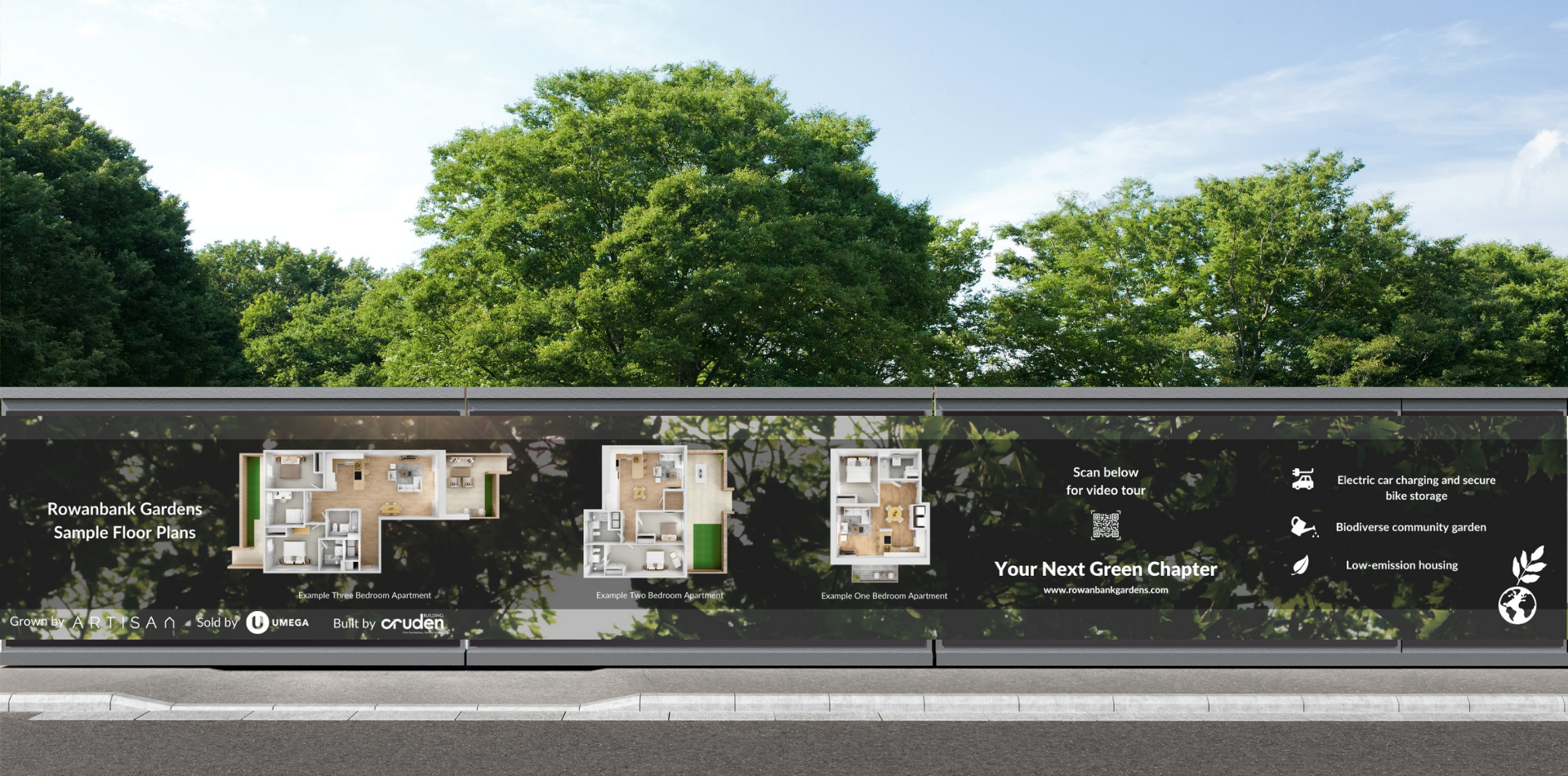
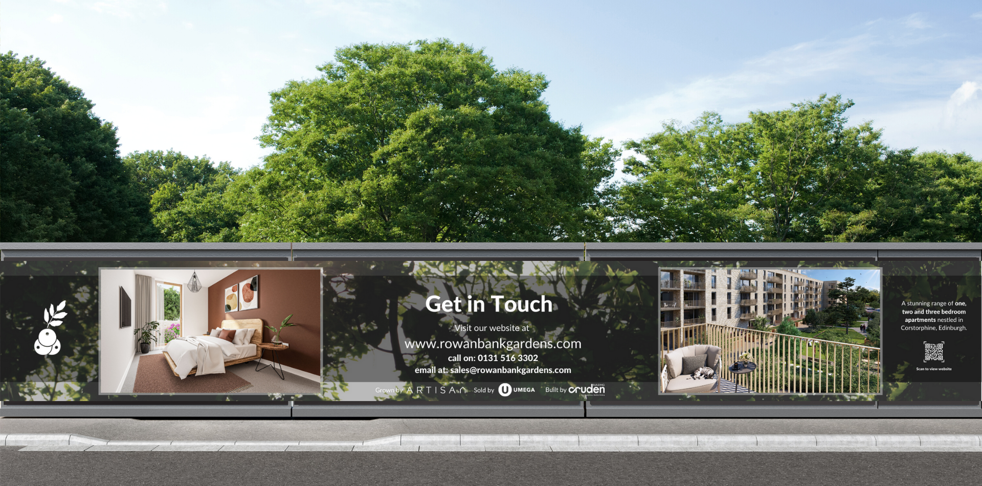
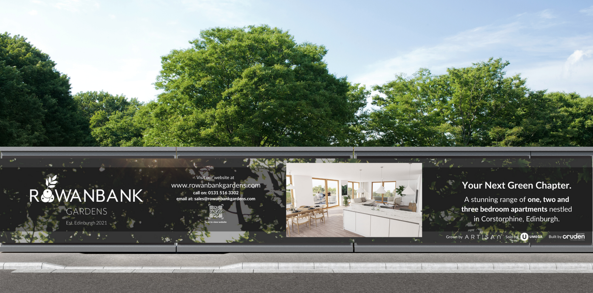
Print and Installation
With an expansive canvas to paint on, the goal here was to create a user-friendly experience, that takes the viewer on a journey of discovery. Walking alongside the hoarding, it expands to a extensive 87m. Walking down, the viewer must be able to stay present with the content, so through the brainstorming process, Nest concepted, designed and artworked almost 100m of engaging and visually stunning subject matter.
All hoarding and signage were designed with continuity in mind - a common thread of branding to ensure a well mapped-out feel to Rowanbank Gardens. With long boards stretching around the site, we wanted to ensure a balance of strong visuals, accessible CTAs and a strong sense of identity. They are encouraged at many points to scan along QR codes, which directed viewers directly to the website, social media handles, as well as clear iconography which communicates vital information in a clear and easy format.


Copywriting
Brand tone of voice was kept neutral and uplifting; the target audience being of varying demographics demanded a relaxed and comforting resonance. Our copywriter endeavoured to bring a sense of comfort and familiarity with the content, utilising shorter phrasing and keeping descriptions pointing audiences to key CTAs. Heavy emphasis was placed on sustainability, as well as some more technical language used to expand on architectural features, integrated into the heart of Rowanbank Gardens.
With 2021 coming to a close, and 2022 sitting in the not too distant future, Team Nest are delighted to have been involved in such a brilliant project. We anticipate a fantastic coming quarter and look forward to continue working with the talented teams at Artisan Real Estate and 7N Architects on future projects to come. Rowanbank Gardens is the cornerstone of sustainable developments in Scotland, and we are so proud to have been directly involved in its fruition.